WebEOC
WebEOC is one of the leading Emergency Management Platforms. Utilizing mini-applications called "boards," it provides a large platform to build and integrate on.
We have developers that are very experienced in creating applications within this platform. Most importantly though, we know that you can't make everybody's system the same. We design and build based on what's best for the agency using it. We know that if you are an EM organization, it sometimes makes the most sense to keep all resources local so they are available despite internet outages. We can still make that look wonderful!
File attachments are extremely common, but it's one place we've found a little lacking in WebEOC. It's not obvious when something is attached and it's hard to tell what's actually there. Our attachment template makes there still only be a single field, but also shows previews of the attachment and is very clear on removal and showing what's currently there.

We also love responsive and subtle design. We use the idea of "floating" labels, when they denote the name of that data, but in a subtle way.
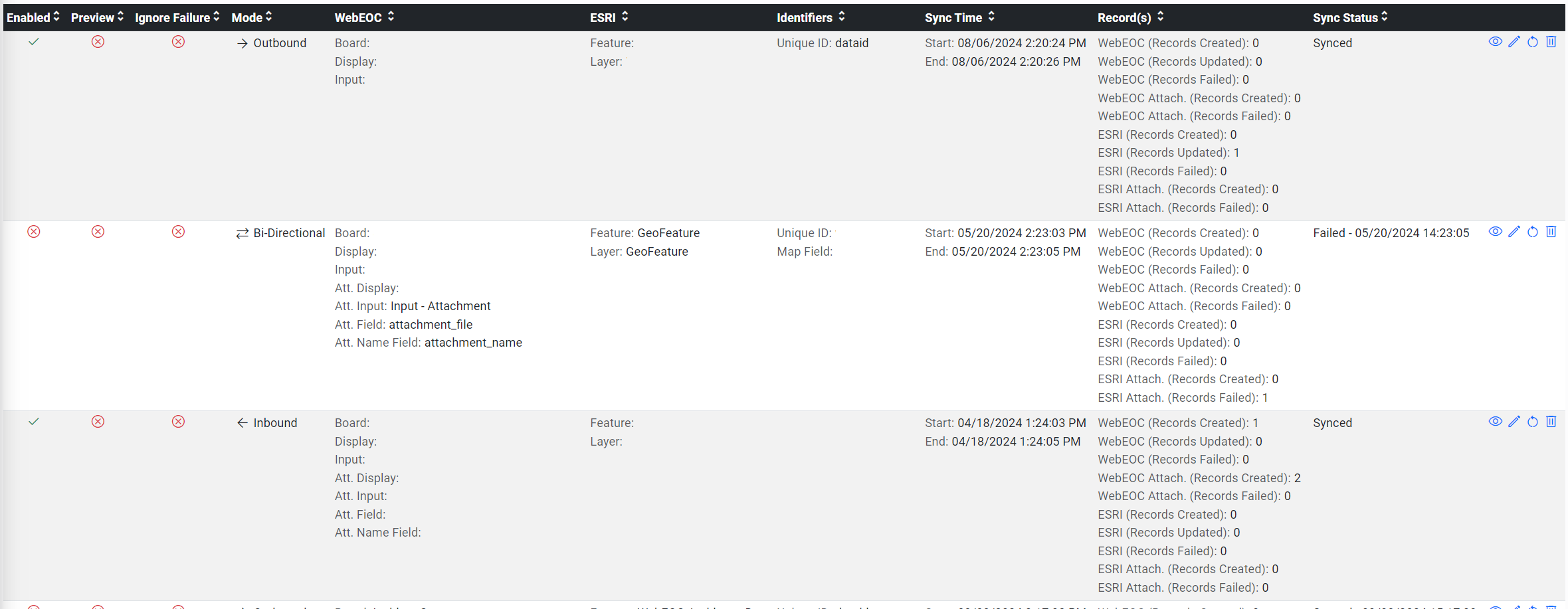
ArcGIS is commonly used at EM agencies. While there is an integration that WebEOC provides, it was lacking in a few areas. You couldn't sync with a feature that already existed. Attachment syncing was limited to specific fields. When using Bi-directional syncing there tended to be instability.

We decided to create an integration that is managed via a Board. We link this with our Integrations platform. And together, these work together to bring all of those missing features and functions into WebEOC.
When we develop boards, we try to use community-driven libraries. Why? It will continue to be supported for a very long time. It's always kept relevant. We prefer to design using a library called "Bootstrap." This is a community styling library that grants some modern and sleek design capabilities. It's allowed us to build responsive designs that look great whether on a computer monitor or your phone.

Our list views use easy-on-the-eyes concepts. Simple icons that display their function when your house moves over them. Clear navigation options with subfiltering built in. Keep in mind, these are the possibilities. We believe in designing a look that matches what your organization desires.

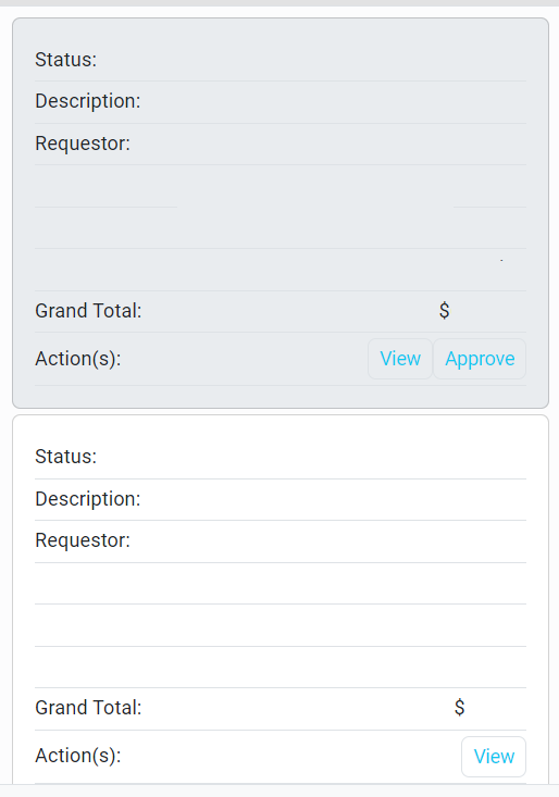
Tables are great for looking at a lot of data on your desktop, but what about on a phone? Zooming in, trying to move the screen around... We made a function that converts tables to card lists when in mobile view to make things much easier to navigate.

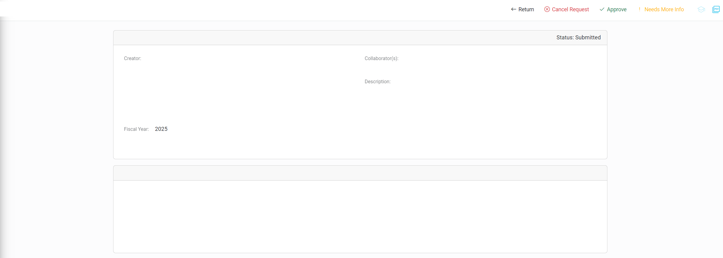
Building on the card idea, separating information into sections makes things much easier to navigate. So what happens when we look at these records?
When we build, we think mobile from the beginning. But we also strive for speed and consistency between applications.